


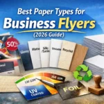
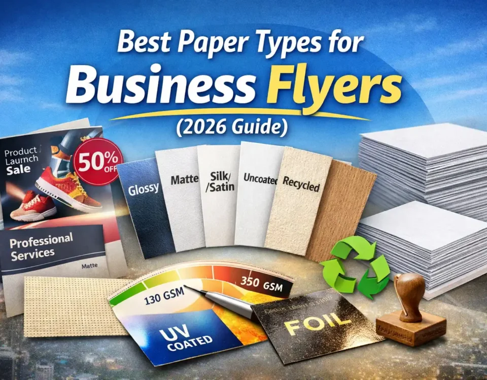
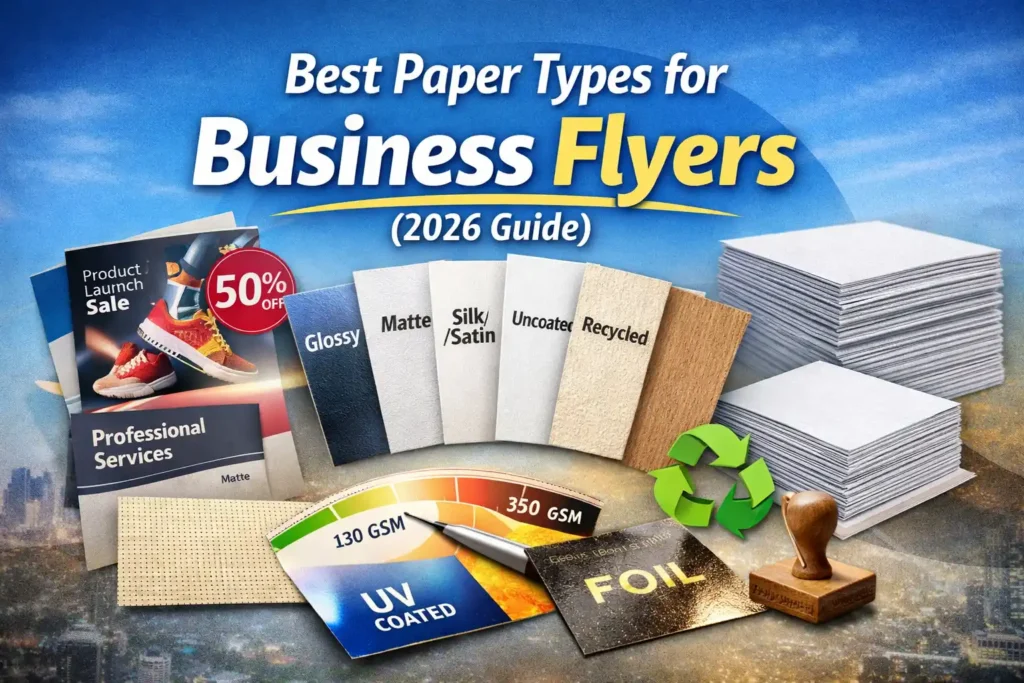
Best Paper Types for Business Flyers (Complete Guide for 2026)
March 12, 2026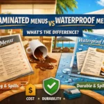
Laminated vs Waterproof Menus: What’s the Difference? (Updated 2026)
March 12, 2026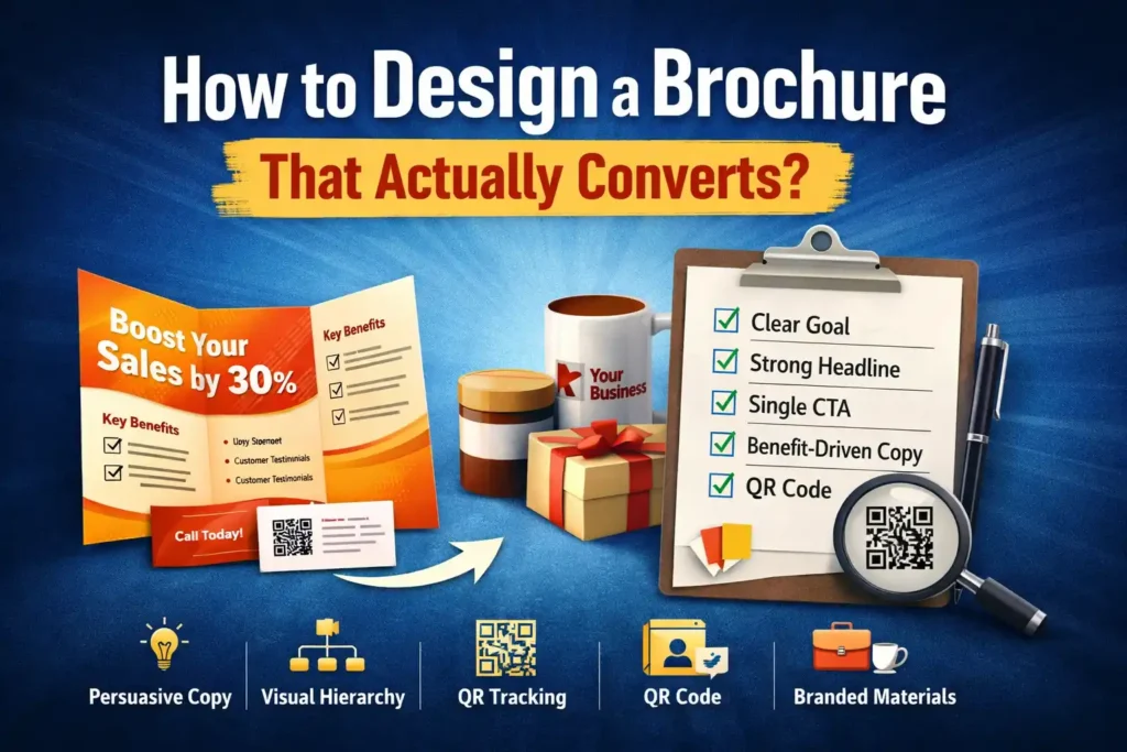
Summary
- A high-converting brochure focuses on one clear goal.
- Strong visual hierarchy guides readers to the CTA.
- Persuasive copy + clean layout improves response rates.
- Brand consistency increases trust and retention.
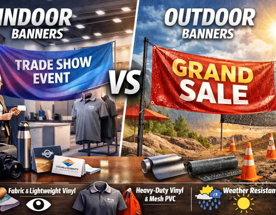
- Pairing brochures with Business Cards boosts conversion follow-ups.
What Makes a Brochure Design Actually Convert?
A brochure converts when it clearly communicates value, guides attention with strategic design, and drives readers toward one focused call to action. Effective brochure design combines persuasive copy, visual hierarchy, and brand consistency to turn interest into measurable responses.
If you’re printing brochures but not getting calls, leads, or sales, the problem usually isn’t printing quality. It’s structure, messaging, and conversion psychology.
Here’s what truly matters.
Why Do Most Brochures Fail to Convert?
Most brochures fail because they overload information, lack a clear CTA, and don’t guide reader attention strategically.
Common brochure mistakes include:
- Too much text
- Weak headlines
- No clear benefit-driven messaging
- Confusing layout
- Multiple competing CTAs
A brochure is not a catalog. It’s a persuasive tool.
High-converting brochure design follows a simple rule: One brochure = one primary objective.
Whether your goal is:
- Booking a consultation
- Visiting a website
- Scanning a QR code
- Calling your sales team
Clarity beats creativity.
How Does Visual Hierarchy Improve Conversions?
Visual hierarchy directs attention step-by-step, increasing readability and guiding users toward action.
Visual hierarchy means arranging elements so readers instinctively know where to look first, second, and third.
Core Hierarchy Structure
- Headline (Attention)
- Subheadline (Clarification)
- Benefits section
- Supporting visuals
- Call to action
Without this structure, readers skim and discard.
Example Comparison Table
| Weak Brochure Layout | High-Converting Layout |
| Dense paragraphs | Short benefit bullets |
| Multiple CTAs | One primary CTA |
| Random image placement | Strategic eye flow design |
| No whitespace | Clean spacing for readability |
| Feature-focused | Benefit-focused |
White space is not empty space. It improves cognitive processing and reduces visual fatigue.
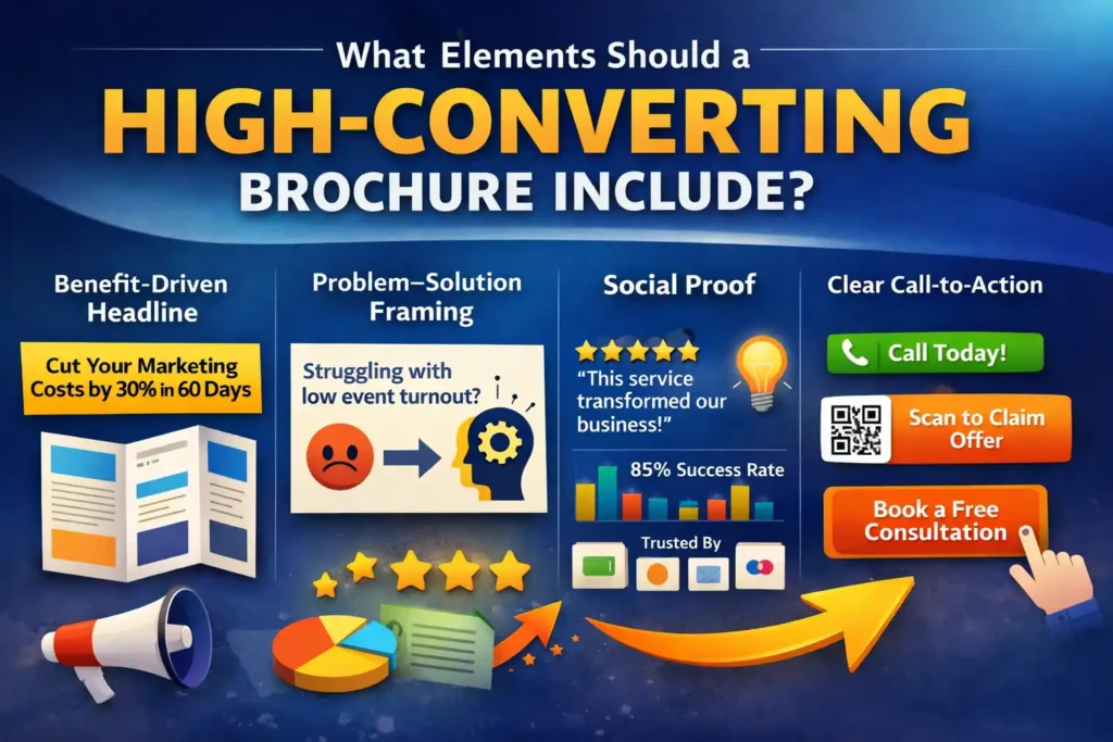
What Elements Should a High-Converting Brochure Include?
A converting brochure includes a strong headline, clear benefits, social proof, compelling visuals, and a single actionable CTA. Let’s break it down:
1) Benefit-Driven Headline
Not “Our Services”
Instead: “Cut Your Marketing Costs by 30% in 60 Days”
2) Problem–Solution Framing
Open with a pain point your audience relates to. Example: Struggling with low event turnout despite heavy promotion? This emotional hook increases engagement time, a key behavioral SEO factor.
3) Social Proof
- Testimonials
- Statistics
- Client logos
Trust increases response probability.
4) Clear Call-to-Action
Examples:
- “Call Today”
- “Scan to Claim Offer”
- “Visit Our Website”
- “Book a Free Consultation”
The CTA must stand out visually using contrast and spacing.
Why Pair Brochures with Other Print Assets?
Combining brochures with complementary print tools increases follow-up actions and retention rates. For example, including Business Cards inside your brochure handout dramatically improves conversion. Why?
- Easy contact retention
- Direct personal touch
- Reduces friction in follow-up
- Builds professional credibility
Instead of forcing readers to search your contact info inside dense text, you give them a detachable response tool. This is especially powerful at:
- Trade shows
- Networking events
- In-store promotions
- Local business outreach
When someone keeps your card, your brochure continues working beyond first contact.
Strategically printed Business Cards reinforce branding consistency, which improves trust perception, a critical factor in conversion psychology.
How Important Is Brand Consistency in Brochure Design?
Brand consistency builds trust and makes your brochure instantly recognizable and memorable. Consistency includes:
- Same fonts
- Same color palette
- Logo placement rules
- Tone of messaging
- Matching marketing materials
When your brochure design aligns with your website, uniforms, packaging, and signage, it strengthens authority. Inconsistent branding causes subconscious doubt. And doubt kills conversions.
Can You Design a Brochure That Converts Step-by-Step?
Yes. A converting brochure follows a structured process: define one goal, map audience pain points, choose the right fold format, design visual flow, place a single strong CTA, and optimize for print usability. Conversion improves when layout supports persuasion, not decoration.
Step 1: What Is the Single Goal of Your Brochure?
A brochure should have one measurable objective—calls, bookings, scans, or store visits. Before opening design software, answer:
- What action do I want?
- Who is this for?
- Where will it be distributed?
Examples:
- Trade show lead capture
- In-store promotion
- Direct mail campaign
- Event handouts
Trying to sell everything on one brochure reduces clarity and hurts conversions. One brochure = One conversion objective.
Step 2: How Do You Choose the Right Brochure Format?
Choose format based on information depth, audience behavior, and distribution method.
Common Formats Comparison
| Format | Best For | Conversion Strength |
| Bi-Fold | Premium services | Clean storytelling flow |
| Tri-Fold | Local businesses | Clear section segmentation |
| Z-Fold | Step-by-step offers | Guided reading journey |
| Booklet | Detailed services | Authority positioning |
If you’re showcasing multiple services, a tri-fold organizes content cleanly. If you’re presenting a premium offer, a bi-fold creates stronger visual focus. The right format improves readability, which improves response rate.
Step 3: How Should You Structure the Front Panel?
The front panel must grab attention and promise value immediately. Your cover should include:
- Bold benefit-driven headline
- Supporting subheadline
- One strong visual
- Minimal text
Think of it like a landing page headline. Bad example: “Welcome to Our Company”
Better example: “Increase Customer Foot Traffic by 40% in 90 Days”
Clarity increases curiosity.
Step 4: Where Should You Place the Call-to-Action?
Place your primary CTA on the inside panel and repeat it on the back for reinforcement. CTA placement strategy:
- Inside right panel → Primary CTA
- Back panel → Contact info + reminder CTA
- Optional QR code near benefits section
Never hide your CTA inside a paragraph. Use:
- Bold text
- Color contrast
- White space around it
This isolates the action visually.
Step 5: How Can Supporting Print Materials Improve Brochure Conversions?
Adding branded materials increases retention, perceived value, and brand recall. For example, distributing brochures inside custom Bags improves portability and reduces disposal. At trade shows or events:
- People collect multiple brochures.
- Loose papers get discarded.
- Branded bags extend exposure time.
A well-designed brochure placed inside professional Bags:
- Protects materials
- Increases visibility
- Extends brand impression duration
Retention directly influences conversion probability. Similarly, adding QR-code-enhanced Stickers & Labels can amplify engagement. For example:
- Place a bold “Scan for 10% Off” sticker
- Add limited-time offer labeling
- Track QR performance analytics
Stickers create visual triggers that drive urgency. This transforms a static brochure into an interactive conversion tool.
Step 6: How Important Is Copywriting in Brochure Design?
Design attracts attention; copy drives action. Use this simple framework:
PAS Formula (Problem – Agitate – Solve)
Problem: Struggling to stand out in crowded markets?
Agitate: Traditional marketing materials get ignored and discarded quickly.
Solve: Our high-impact print solutions increase brand recall and lead capture.
Short paragraphs (2–3 lines max) increase readability on mobile and print. Use bullet points for:
- Benefits
- Features
- Offers
- Guarantees
Avoid long feature lists without context. People buy outcomes, not services.
Step 7: Should Your Brochure Match Other Branding Materials?
Yes. Consistent branding increases trust and conversion reliability. If your staff distributes brochures wearing branded Clothing & Apparel, brand recall strengthens significantly. At events:
- Matching apparel increases professionalism.
- Visual cohesion improves authority.
- Customers perceive higher credibility.
The more consistent your visual ecosystem, the easier it is for prospects to remember you. Brand alignment across:
- Brochure
- Apparel
- Packaging
- Business cards
- Stickers
Creates a psychological trust loop. Trust reduces buying resistance.
Next Best Action
If you’re ready to implement a fully branded print strategy:
- Upgrade your brochures
- Pair them with professional print assets
- Maintain consistent visual identity
- Use measurable CTAs
Explore professional print solutions at Easy Print and build a brochure ecosystem that actually drives results.
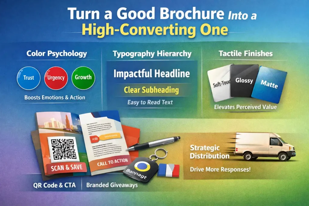
How Do You Turn a Good Brochure Into a High-Converting One?
A brochure converts at a higher rate when it combines persuasive design psychology, premium print finishes, consistent branding, and strategic distribution. Small upgrades, like tactile finishes, QR integrations, and branded giveaway pairings, can significantly increase engagement and response rates.
Now let’s move from “well-designed” to “conversion-optimized.”
Does Print Psychology Really Influence Brochure Results?
Yes. Color, texture, and layout psychology directly influence reader trust and action-taking behavior.
1) Color Psychology
- Blue → Trust & stability
- Red → Urgency & action
- Green → Growth & balance
- Black → Luxury & authority
CTA buttons in contrasting colors increase response visibility.
2) Typography Hierarchy
Use:
- Large bold headlines
- Medium subheads
- Clean body fonts
Readable typography reduces cognitive friction.
3) Tactile Finishes
Matte, gloss, or soft-touch lamination increases perceived value.
Perceived value increases perceived credibility.
People are more likely to respond to premium-feeling materials.
How Can Branded Giveaways Improve Brochure Conversions?
Pairing brochures with useful branded items increases retention and brand recall. For example, handing out brochures with customized Drinkware extends exposure time dramatically. Why this works:
- Mugs and bottles are used daily.
- Repeated exposure reinforces brand memory.
- Brochure message becomes associated with usefulness.
This creates long-term brand reinforcement beyond initial interaction. Similarly, adding premium Photo Personalized Gifts in loyalty campaigns enhances emotional connection. For example:
- Send brochures + personalized gift to VIP clients.
- Include an exclusive offer inside the brochure.
- Add QR code for a limited-time upgrade.
Emotion strengthens conversion probability. Marketing backed by emotional reinforcement outperforms pure informational marketing.
Should Your Brochure Drive Traffic to a Central Hub?
Yes. A brochure should act as a bridge to your main conversion platform. Your printed material should guide readers toward your core brand destination like Easy Print. Best practices:
- Add QR code linking to the landing page.
- Use short branded URLs.
- Include incentive (discount, free consultation).
This creates measurable engagement. Offline + Online integration improves tracking and ROI.
Advanced CTA Strategy: How Many Calls to Action Should You Use?
Use one primary CTA and one supporting CTA, never more.
CTA Framework
Primary CTA: Book Now / Call Today / Scan to Claim Offer
Supporting CTA: Visit Website / Follow Us / Email Us
Too many CTAs dilute focus. The strongest brochures guide users clearly without overwhelming them.
Standard vs Conversion-Optimized Brochure
| Standard Brochure | Conversion-Optimized Brochure |
| Generic headline | Benefit-driven headline |
| Feature-focused copy | Outcome-focused messaging |
| Single distribution | Bundled with branded items |
| No QR tracking | Trackable QR integration |
| Flat paper | Premium tactile finish |
Optimization always beats decoration.
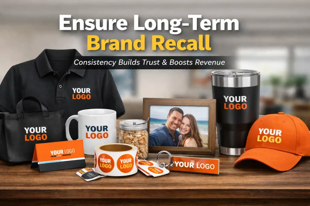
How Do You Ensure Long-Term Brand Recall?
Consistent print ecosystem strengthens memory retention and authority. Your brochure shouldn’t exist alone. When paired with:
- Business Cards
- Clothing & Apparel
- Bags
- Stickers & Labels
- Drinkware
- Photo Personalized Gifts
You create a unified brand experience. Consistency improves trust. Trust increases conversion. Conversion increases revenue.
Final Conversion Checklist
Before printing, confirm:
✔ Clear single objective
✔ Strong headline
✔ Clean visual hierarchy
✔ One primary CTA
✔ QR code tracking
✔ Brand consistency
✔ Supporting print tools
✔ High-quality print finish
If even one is missing, optimize before printing.
Final Takeaway
Here’s what matters most:
A brochure that converts is not just well-designed, it is strategically engineered.
- It speaks directly to one audience.
- It solves one clear problem.
- It guides readers toward one defined action.
- It integrates with other branded materials.
- It bridges offline interaction to online conversion.
When design, psychology, and distribution align, conversion becomes predictable.
FAQ Section
What is the ideal size for a high-converting brochure?
The best size depends on distribution, but tri-fold and bi-fold formats work best for readability and structured messaging.
How many pages should a brochure have?
Keep it concise. 2–6 panels for services, booklet format for detailed offers.
Should brochures include QR codes?
Yes. QR codes increase trackability and bridge offline-to-online conversion.
Is glossy or matte better for brochure conversion?
Matte feels premium and professional. Gloss works well for image-heavy designs.
Can small businesses benefit from brochure marketing?
Absolutely. When strategically designed, brochures remain one of the highest ROI offline marketing tools.